

How a DTF Color Chart Ensures Consistent Print Quality Across Batches
What Is a DTF Color Chart and Why Does It Matter?
A DTF color chart is a printed grid of standardized color swatches created using your specific DTF printer, inks, transfer film, and curing process. It typically includes CMYK values, common brand colors, or even full gradients, giving you a clear, physical reference of how colors actually appear on your setup. Unlike relying solely on screen previews or ICC profiles, a DTF color chart acts as a tangible benchmark that reflects real-life output.
This chart helps solve common pain points that DTF operators face, such as inconsistencies in ink density between batches, variations in white ink underbase opacity, powder adhesion issues, and how different substrates influence the final color. These factors can all lead to unwanted color shifts that impact print quality.
Whether you run a small shop or manage high-volume production, using a DTF color chart benefits you by enabling faster client approvals, reducing costly revisions, and maintaining consistent brand color fidelity across batches. It’s an essential tool for solid DTF color management that keeps your prints reliable and your clients happy.
Key Factors That Cause Color Inconsistencies Across DTF Batches
When working with DTF printing, several variables can cause noticeable color inconsistencies from batch to batch. Understanding these factors is key to maintaining consistent DTF print quality control.
Ink formulation and age: Over time, pigments can settle, and ink viscosity may change. This affects color density and vibrancy, often leading to dull or uneven prints. Fresh ink batches perform differently than older ones.
Transfer film differences: Variations in coating thickness or batch-to-batch film quality directly impact ink adhesion and final color appearance. Using a consistent supplier or film series, like the DTF transfer film from Jinlong, helps reduce this risk.
Printer variables: Nozzle condition, printhead alignment, and RIP software settings dramatically influence color output. Clogged nozzles or misaligned heads cause streaks or color shifts. Proper routine printer calibration guides keep these issues in check.
Environmental factors: Humidity and temperature affect ink curing and powder adhesion. For example, high humidity slows curing, leading to colors that look washed out or less vibrant.
White ink layer thickness and curing: The opacity of the white underbase is crucial since it acts as the color foundation. Variations in white ink thickness or curing parameters cause color shifts, especially on dark or colored garments.
Design file handling: Improper RGB-to-CMYK conversions during file preparation introduce unexpected hue shifts and saturation changes. Accurate color profiles and design setup are vital for consistent DTF color management.
These small variations can add up quickly, especially in multi-batch runs. That’s why a reliable DTF color chart is essential—it helps detect early color shifts so you can adjust print settings before large orders go out. Maintaining tight control across all these factors ensures consistent DTF color calibration and high-quality prints every time.
How a DTF Color Chart Maintains Print Quality and Consistency
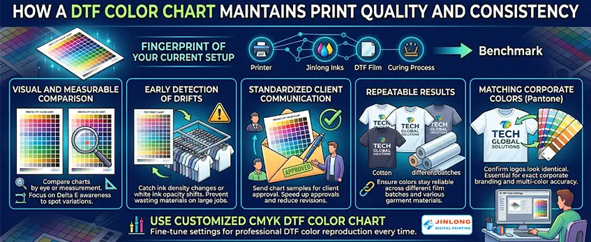
Printing and referencing your own DTF color chart acts like a “fingerprint” of your current setup—capturing your printer, inks, film, and curing process in one physical benchmark. This helps you maintain consistent print quality across batches and quickly spot any shifts before a full production run.
Here’s how a DTF color chart supports consistent DTF color management:
- Visual and measurable comparison: Even without expensive tools, you can monitor color variations using Delta E awareness by comparing printed charts side-by-side.
- Early detection of drifts: Catch ink density changes or white ink opacity shifts before wasting materials on large jobs.
- Standardized client communication: Sending chart samples for client approval speeds up approvals and reduces revisions.
- Repeatable results: Whether printing on different DTF film batches or switching between cotton and polyester garments, your color chart ensures the colors stay reliable.
For example, when matching exact corporate Pantone colors, the chart confirms your multi-color logos look identical across various fabrics and orders, preventing costly mismatches. Using a customized CMYK DTF color chart also helps fine-tune your RIP color settings tailored to your jinlong DTF inks and film for professional DTF color reproduction every time.
By embedding this physical reference into your workflow, you establish a solid foundation for consistent, high-quality DTF transfers batch after batch.
Step-by-Step Guide to Creating and Printing Your DTF Color Chart
Creating a reliable DTF color chart is key to maintaining consistent DTF print quality across batches. Here’s a straightforward process to get you started:
Prepare Artwork in CMYK Mode
Use your design software to create the chart in CMYK mode, ensuring your color values are accurate and matched to your target hues. This helps prevent issues common with RGB-to-CMYK conversions in DTF printing.
Select or Build a Comprehensive Chart
Include essential color swatches like primary colors, skin tones, gradients, and any critical brand colors you frequently print. This diversity helps cover a wide range of real-world printing needs.
Optimize RIP Settings for jinlong DTF Inks and Film
Configure your RIP software to align with your specific jinlong DTF inks and film batch characteristics. Proper RIP color management is crucial to achieve consistent DTF color calibration and overall print quality control.
Print Under Controlled Conditions
Maintain stable white ink layer thickness and consistent powder application during printing. Using controlled conditions helps reduce variability caused by ink opacity or powder adhesion differences; see tips on managing white ink issues with jinlong DTF systems.
Cure/Heat Press the Chart Using Standard Parameters
Follow your standard curing or heat press guidelines exactly. Environmental factors during curing can affect the final color output, so consistency here is vital for reliable DTF color consistency.
Label Your Chart Clearly
Include notes on the printing date, ink batch, film lot, and any relevant environmental conditions during print and cure. This record helps track batch-to-batch differences and troubleshoot quickly if colors drift.
Extra Tips for Durability and Ease of Use
- Lamination: Protect your color chart with lamination for long-lasting reference, especially in busy production environments.
- Multiple Copies: Print several copies to keep at different stages of your workflow—near the printer, with the design team, and for client approvals.
Following this process sets a strong foundation for professional DTF color reproduction and efficient batch color matching, ensuring each transfer meets your quality standards.
Best Practices for Testing and Using Your DTF Color Chart
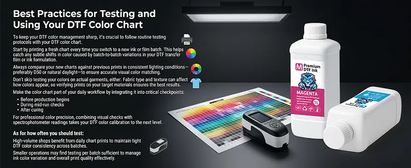
To keep your DTF color management sharp, it’s crucial to follow routine testing protocols with your DTF color chart. Start by printing a fresh chart every time you switch to a new ink or film batch. This helps catch any subtle shifts in color caused by batch-to-batch variations in your DTF transfer film or ink formulation.
Always compare your new charts against previous prints in consistent lighting conditions—preferably D50 or natural daylight—to ensure accurate visual color matching. Don’t skip testing your colors on actual garments, either. Fabric type and texture can affect how colors appear, so verifying prints on your target materials ensures the best results.
Make the color chart part of your daily workflow by integrating it into critical checkpoints: before production begins, during mid-run checks, and after curing. For professional color precision, combining visual checks with spectrophotometer readings takes your DTF color calibration to the next level.
As for how often you should test, high-volume shops benefit from daily chart prints to maintain tight DTF color consistency across batches. Smaller operations may find testing per batch sufficient to manage ink color variation and overall print quality effectively.
For more tips on managing your DTF setup, check out our guide on optimizing RIP settings for DTF inks and films.
Troubleshooting Color Shifts Using Your Chart
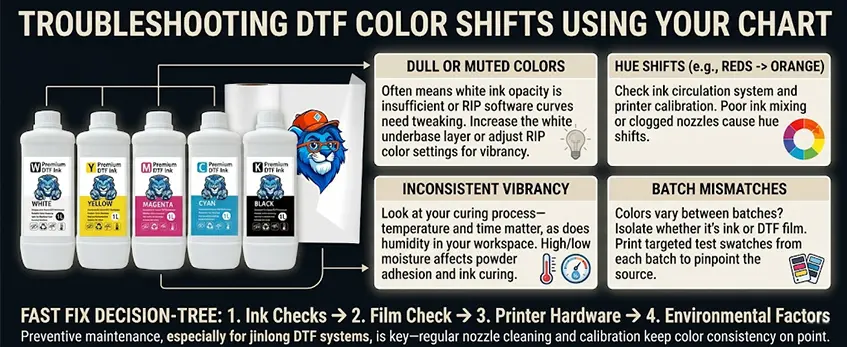
When you notice color shifts in your DTF prints, your DTF color chart is your best diagnostic tool. Here’s how to tackle the most common print issues:
Dull or muted colors: This often means the white ink opacity isn’t enough or the RIP software curves need tweaking. Increasing the white underbase layer or adjusting your RIP color settings can bring vibrancy back.
Hue shifts (for example, reds turning orange): Check your ink circulation system and printer calibration. Poor ink mixing or clogged nozzles can cause reds and other hues to skew off-target.
Inconsistent vibrancy: Look at your curing process—temperature and time matter, as does humidity in your workspace. High or low moisture can affect powder adhesion and ink curing, so keep conditions stable.
Batch mismatches: When colors suddenly vary between print batches, isolate whether it’s your ink or DTF film causing the shift by printing targeted test swatches from each batch. This helps pinpoint the root source before a full run.
For a faster fix, follow a simple decision-tree approach: start with ink checks, move to film, then printer hardware, and finally environmental factors. Preventive maintenance, especially for jinlong DTF systems, is key—regular nozzle cleaning and calibration keep color consistency on point.
Using your DTF color chart regularly saves time and ensures consistent DTF transfers, reducing wasted stock and client complaints over color mismatches. For guidance on applying powder and curing for best results, see jinlong’s DTF printer and shaker vs manual powder application.
Advanced Tips for Long-Term Color Consistency with jinlong DTF
To keep your DTF color consistency rock-solid over time, it’s key to fold your color chart into a broader color management routine. Start with regular printer calibration and nozzle checks—dirty or misaligned nozzles can quickly throw off your color accuracy. For jinlong DTF inks, using custom ICC profiles tailored specifically for jinlong DTF inks and films can hugely improve how your colors translate from screen to print.
Environmental factors matter too. Aim to keep your workspace at stable temperatures with humidity between 40-60% to avoid fluctuations that impact ink drying and powder adhesion. On the software side, leverage your RIP’s color management features to control color output better and maintain consistent DTF print quality across batches.
For shops scaling up, digitally archiving all your DTF color charts and implementing version control helps track changes and ensures repeatable results, no matter how many batches you print. Jinlong DTF’s ink formulation is designed for stable, vibrant output, but paired with disciplined charting and color management, you’ll get professional DTF color reproduction time after time, minimizing the common issues like DTF ink color variation or white ink opacity shifts.
For a deeper dive into managing your white ink layers, you might find this DTF white ink guide helpful to ensure your underbase stays consistent and strong to support vibrant colors.
By following these advanced tips, your jinlong DTF setup will deliver consistent color results that make batch-to-batch color matching easier and your clients happier.


